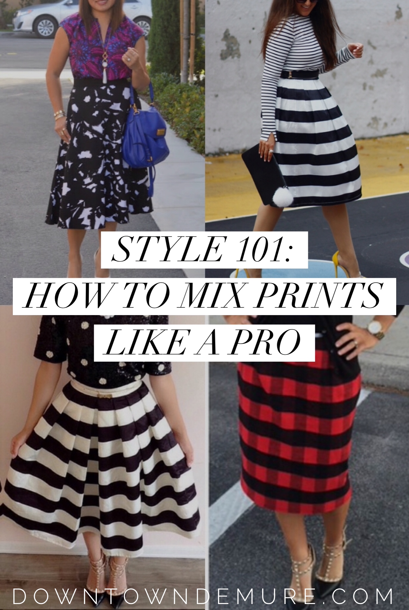
Style 101: How to Mix Prints Like a Pro (ft. Examples From Real Women With Style)
This is the fifth installment of the STYLE 101 Series — A series dedicated to helping you enhance your sense of style. To check out the rest of the series, go HERE.
Several of my lovely readers who took my reader’s survey in June asked for tips on how to mix prints — and for good reason! Print mixing is not just a fun way to showcase your personality through your clothing – it’s also an excellent way to get more use out of the clothes you already own by mix and matching seemingly mismatched prints into stylishly cohesive outfits.
So, I figured it’s time to address this sophisticated style technique, but I do so with a caveat: I do not consider myself a pro at mixing prints because I honestly don’t do so frequently. Take a glance at my outfits page, and you’ll notice I like effortlessly chic and feminine clothing. And to me, mixing prints often = effort I’m not willing to exert. *shrugs* However, I HAVE read way too many posts and even a couple of books that thoroughly outline how to mix prints and patterns well.
Each of those sources included repeated references to 6 key guidelines for mixing patterns:
- Pair a bold or large pattern with a smaller or less dominant pattern
- Each pattern should have a common, unifying color
- Treat leopards and stripes are neutrals
- Wear no more than 2-3 patterns at a time
- Mixing different textures counts as print mixing
- Include a neutral of some sort (neutral cardigan, accessories, etc.) to tone down mixed prints
- Wear common prints in different colors or scales
If you’re a print-mixing novice, reading through that list likely caused some head scratching. Rather than describe each rule in detail and likely confuse you even more, I’m going to illustrate the above rules using examples from real-life fashionistas (who happen to be adorable blogging friends of mine) and explain WHY their ensembles work so well.
Stripes on Stripes with Freidy @ Style Addition
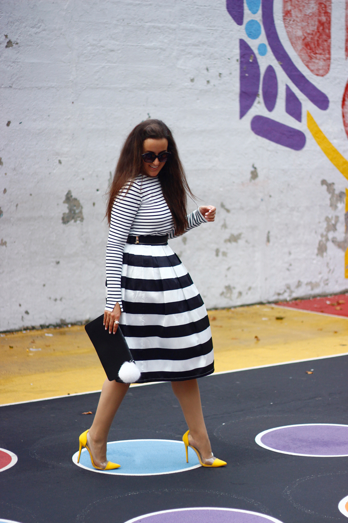
Why it works:
1) She paired a large dominant print (wide awning stripes in the skirt) and a smaller, less overwhelming print (thin dress stripes in the top)
2) She used the same pattern in different scales
3) Two common, unifying colors between both prints (black and white)
4) Understated use of punchy accessories
If you’re new to the print mixing game, a good first step is to mix the same type of print in different sizes or colors. Mixing stripes is an easy and chic way to do that. Just pay attention to how stripes work with your body shape. For example: If you have triangle-type body shape (the widest part of your body is your hips and below), you may not want to place the large, dominant print on the bottom because it will draw attention to the widest part of your body.
Stripes on Plaid with Heather @ Savvy Skirt Girl
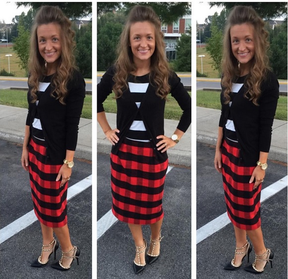
Why it works:
1) The skirt and the top have one unifying color: black.
2) She only wore two prints: stripes and buffalo plaid. (Any more might’ve been overwhelming.)
3) She used a neutral clothing item (black cardigan) and accessories (gold watch and black studded heels) to tone down the outfit. The cardigan is perfect here because she is wearing two dominant prints, but the cardigan breaks up the striped shirt so that it isn’t as dominant as the buffalo plaid skirt. The heels and watch also help the outfit look polished.
If you were to hold up that striped top with the buffalo plaid separate from the buffalo plaid skirt in a store, you likely wouldn’t think of pairing them together. But here’s a tip for successful print mixing: match colors and not prints. If there is at least one unifying color between two dissimilar prints, chances are they can work together.
[bctt tweet=”Here’s a tip for successful print mixing: match colors, NOT prints. Dissimilar prints can work well together if there is at least one unifying color.”]
Polka Dots and Stripes with Modestly Hot
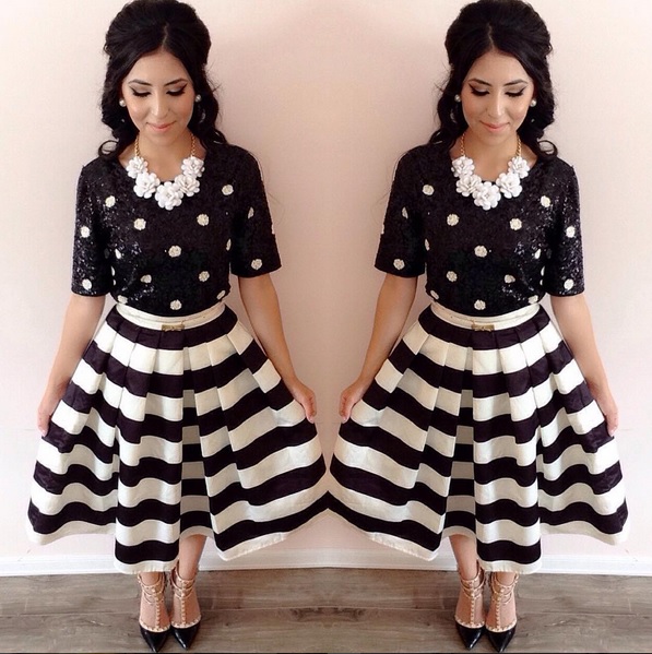
Why it works:
1) A unifying color scheme: Black and white. Everything in this outfit falls within that color scheme, so the outfit is harmonious. As I said above, mix colors and not prints.
2) She mixed two textures (poly skirt and sequin shirt)
3) There is one dominant, large print (the awning striped skirt) and a less dominant, smaller print (the polka dot top).
Side note: apparently those Valentino-inspired studded heels go with EVERYTHING.
Floral on Floral with Alice @ Happiness At Midlife
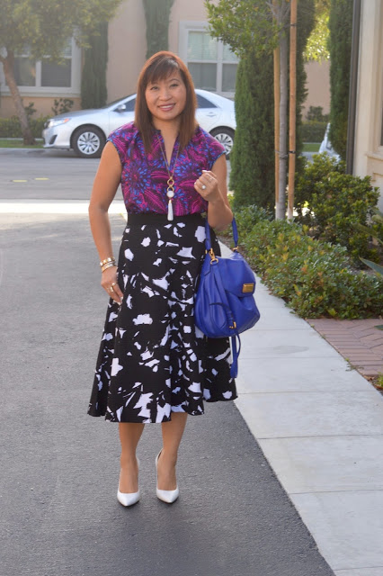
Why it works:
1) She used two similar prints (floral).
2) There are common colors in the outfits and the accessories: black, blue, and white.
3) There is one dominant print: the graphic black and white print on the skirt.
I consider Alice a pro at print-mixing (but she’s so humble she likely wouldn’t agree). She has a firm grasp on the “rules”, so she’s comfortable playing around with prints and even bending the “rules” a bit. There aren’t common colors between the skirt and the top; however the accessories help to anchor the outfit and make it look cohesive. The white necklace and shoes go well with the dominant white color in the skirt and the blue satchel goes well with the dominant blue in her top. It doesn’t hurt that both prints are gorgeous on their own and even better together.
I hope this post shows how easy it can be to mix prints into beautiful, wearable outfits! The best way to improve your print mixing skills is to practice. So go into your closet and start playing with that gingham top or that striped skirt you traditionally wear exclusively with neutrals. Snap some pics in the mirror to help you figure out what works and what doesn’t.
Tell me, are you into print mixing? What are some of your go-to combinations and guidelines?
Linking up with: More Pieces of Me and On the Daily Express // Style to Inspire // Manic Mondays //Mix It Mondays // Pink Sole // Still Being Molly // Turning Heads Tuesday // Style Elixir // Garay Treasures // Pleated Poppy //Because Shanna Said So //Stylish Housewife // The Wednesday Pants // Style Me Wednesday // Happiness at Mid Life // The Red Closet Diary // Mix Match Fashion // Thursday Fashion Files // High Latitude Style //Friday Favorites // Birdie Shoots // Pumps and Pushups // Because Shanna Said So // Favorite Fashion Friday
The Comments
Alecz
I love pattern mixing, and you’ve chosen some great bloggers to feature. Alice from Happiness at Midlife is the QUEEN of this trend!
https://forsevenseasons.wordpress.com
Elizabeth
> AleczI agree! When I decided to write this post, she was the first person I messaged!
Happiness at Mid Life
Liz – I am so honored that you included me in this post. There are some great tips in this post!
Alice
http://www.happinessatmidlife.com
Hope to see your Thursday for TBT Fashion link up.
Elizabeth
> Happiness at Mid LifeThe honor is ALL mine. Seriously. Thanks for letting me feature you!
Style Bits & Bobs of M.E.
Great post. I don’t mix prints a lot, but when I do I like to play with the same color family. Mindy of The Mindy Project is the queen of mixing prints on TV. Also, I like prints because they are so fun and playful 🙂
Elizabeth
> Style Bits & Bobs of M.E.Thanks! I’ve never watched the Mindy show, but I may have to google her so I can check out her print mixing skills!
Margaret
I love this post! It was very helpful! I personally love to see someone mix prints but I’m afraid I don’t do it that often, but that may change now that I have read this 🙂
-Margaret
http://happyinheels.blogspot.com/
Elizabeth
Pattern mixing is so much fun! I never thought that I could do it, but I did it a couple of times this year, and it was really easy! My favorite patterns to mix are stripes and floral, mainly because I just love those patterns!
Melissa
Mixing patterns is fun! I love mixing plaid with floral.
Melissa
Stylista Fitness
Elizabeth
> MelissaI don’t try plaid with floral often, but i should! You just inspired a new outfit for me, Melissa. ????
Michelle
These tips are perfect! Thank you for sharing! I will keep these all in mind!
xo Michelle Paige
http://www.michellespaige.com