
This is the second to last post in this Style 101 series (which took much longer to complete than I anticipated — sorry, y’all!). Throughout this series, I touched on several foundational concepts for transforming the way you dress — without having to buy a new wardrobe. I hope I made it clear that new clothes aren’t always the answer to your style woes. You should spend less time shopping and more time trying to figure out what looks good on YOU by developing an understanding of proper fit and your personal proper style. Then you can use awesome techniques like pattern and print mixing to build stylish outfits and get more use out of clothes you already use.
This week I want to touch on the crucial topic of color theory. Why am I devoting a whole post to color theory in a series about style? Because learning how to build attractive color combinations can help you unlock a world of potential in your closet full of nothing to wear.
I present to you the useful-but-intimidating color wheel. Turns out this visual aide you used in your 6th-grade art class is incredibly useful for building beautiful outfits. Whenever you’re stumped and don’t know which colors would look good with each other, let this wheel be your guide.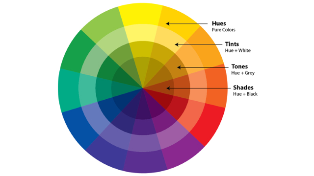
In order to take full advantage of the color wheel, let’s review some very basic color distinctions and relationships.
Primary Colors: Primary colors are colors that create a full range of colors when combined. For our purposes, we will stick with red, blue and yellow as our go-to primary colors.
Secondary Colors: Secondary colors are colors that form when primary colors are combined. That would be orange (red and yellow), green (yellow and green), and violet (blue and red).
Tertiary colors: Tertiary colors result from mixing primary and secondary colors. That would include coral (red and orange), lime ( yellow and green), and teal (blue and green)
Neutrals: Neutral colors are the color wheel rejects. They have little to no undertones of other colors, so they don’t ‘pop’ as much as other hues. You likely have an intuitive sense of what these are: black, white, beige, tan, taupe, to name a few.
Saturation: Saturation refers to how vivid and intense a color is. If a color has high saturation, it will appear bright and rich. When a color has poor saturation, it will appear faded. Here’s an example:

Each color in its purest form is a hue. A tint is a hue mixed with white; a shade is a hue mixed with black; and a tone is a hue mixed with grey. If that seems like too much to remember, don’t fret. You don’t need to worry about the technical terms much for building outfits. You should be much more concerned with learning harmonious color relationships:
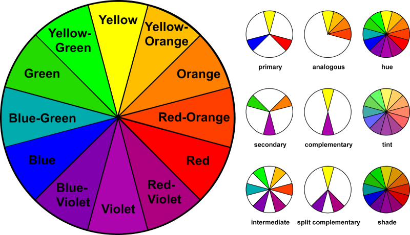
Complementary: Two colors that are opposite each other on the color wheel (e.g., blue and orange). This is a BOLD color pairing, so take baby steps incorporating this combination into your wardrobe. Use a primary color as your base (e.g. blue dress) and then incorporate a complementary color with accessories (e.g. and light, tinted orange scarf).
Split complementary: This scheme uses three colors, starting with one color and then matching it with two colors adjacent to its complementary color. For instance: Green matched with red-violet and coral, which are adjacent to red. This is one of my favorite color schemes because it’s easy to execute with a little help from the wheel.
Analogous: Three colors that are next to each other on the color wheel. One of my favorite analogous color schemes is purple, red and orange. If you decide to play with this color scheme, make sure you use ONE color as the dominant color and use the other two colors as accents. You should also consider playing with tinted colors and not rich, saturated colors.
Triadic: Three colors that are equidistant from each other on the color wheel. Think: Violet, orange, and green – the three main secondary colors.
Monochromatic: This is a deceptively simple color scheme that’s comprised of just one color. It seems easy to execute, but it can easily be boring and flat. To pull this off, I recommend: 1) wear the same color in different tints, shades, tones and levels of saturation, and 2) play around with fabric textures to add more dimensions to your outfit.
The graphic and terms above likely don’t provide much creative inspiration on their own, so let’s look at how the pros have applied color theory to create beautiful clothing:
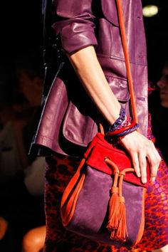
Complementary
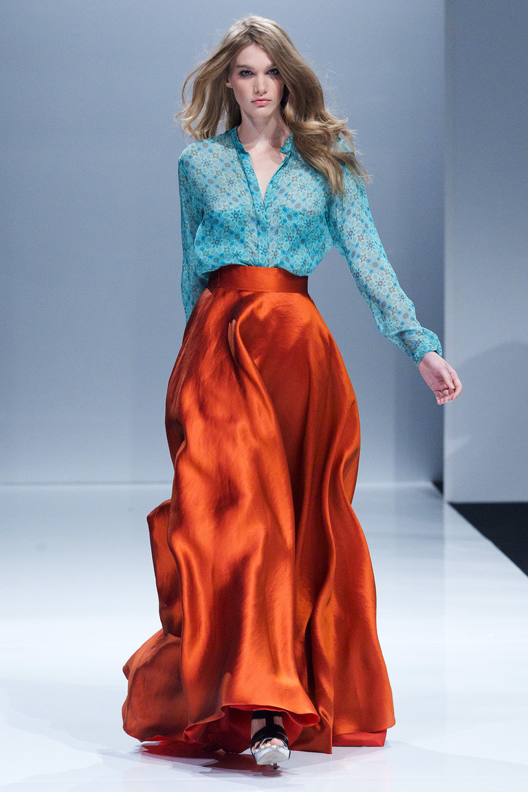
Alex Terekhov
Why it works: This outfit is beautiful example of a complementary color pairing that’s also wearable. The key is to choose one color as the dominant color and keep the other color restricted. In this example, the saturated copper skirt is the focal point and the turquoise blouse with coopery accents is the perfect complement.
Split Complementary
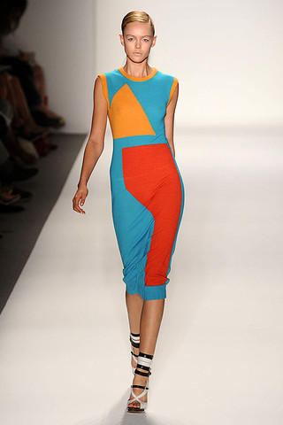
Prabal Gurung
Why it works: The base color is teal, and it’s appropriately the dominant color in this dress. The other colors (orange and red) are the colors adjacent to teal’s complementary color: red-orange. The designer also used neutral colored accessories that don’t clash with the vibrant color combinations in the dress.
Analogous
Salvatore Farregamo
Why it works: The three colors in this outfit – purple, orange and red — are adjacent to each other on the color wheel, and thus look beautiful when combined. Even though there are three vibrant colors in this outfit, purple is still the dominant color and the other colors are used as accents. It’s all about balance, y’all.
Triadic
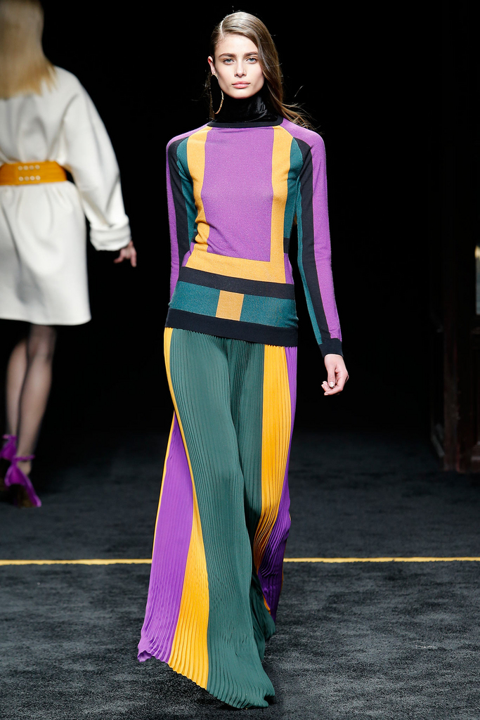
Balmain
Why it works: This jumpsuit utilizes a popular triadic scheme – green, violet and orange — in darker shades, which makes it more appropriate for fall. The black strips of fabric intermingled between the three colors also anchors them, preventing them appearing too jarring when paired together.
Monochromatic
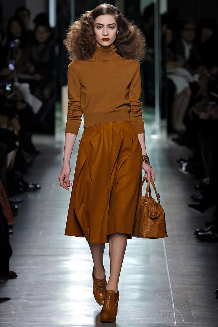
Why it works: This is an example of how to wear a monochromatic neutral outfit well. The key is to play with textures to add dimensions and interest to your outfit (because wearing all cotton or all leather would be boring). This outfit has leather, wool, and possibly cashmere, and together they enhance an otherwise bland color palette.
Some parting tips:
- Don’t mix more than three colors at a time unless you’re very confident in your color mixing abilities or you just don’t care about looking cray cray. 😉
- No matter what color scheme you utilize, make sure you choose one color to be the dominant color in your outfit. Use the other colors as accents.
- Use neutral colors to tone done color combinations with high contrast.
- Don’t feel like you HAVE to stick to the color wheel. Feel free to have fun and wear whatever colors make you feel pretty.
The Comments
Alecz
I’ve honestly never thought of colour matching like this before, and it’s so helpful! Great to know WHY some colours work together and some just don’t.
http://forsevenseasons.wordpress.com
Elizabeth
> AleczThanks, Alecz! Isn’t color theory is a fascinating topic? I think the color wheel is especially helpful for those who don’t have an innate understanding of harmonious color combinations.
Sandy a la Mode
gosh i love that first complementary outfit with that orange skirt!!
xo,
Sandy
Sandy a la Mode
Elizabeth
Wow, I never knew there was so much technicality in colors! lol There are two big things that have helped me. One is just getting on Pinterest! lol If I’ve got a new skirt and I’m not sure which color will look good with it, I search that color skirt on Pinterest to see what others are pairing with it. Basically, I cheat lol! And another thing I do is just get in my closet and start trying stuff on together. Sometimes it will surprise you what looks good together!
Style Bits & Bobs of M.E.
Great post! I like earthy tone neutrals as well as bold colors and fun prints. I’m going to talk more about my signature style in an upcoming post. Analogous and complementary are so beautiful! 🙂
Jill
This was interesting to read about what works and why! There is so much to know about color! Please stop by tomorrow and link up with Thursday Fashion Files!
Jill
Doused In Pink
Ana Luiza
This is a really great break down! Thanks for linking up with us on Start the Week Stylish
– Ana Luiza
The Northwest Blonde
Elizabeth
> Ana LuizaThanks, Anna! Always happy to join your lovely linkup!
Anna Parker
This is so helpful! I took an art class in high school where I learned about color theory and this is a great reminder! Thanks so much!
~Anna
http://whatshouldbein.blogspot.com/
Elizabeth
> Anna ParkerThanks for reading, Anna!
Michelle
This is a perfect post! I loved learning about the reasoning behind WHY colors work together!
http://michellespaige.com
Elizabeth
> MichelleThanks so much, Michelle! So happy to hear you found the post helpful.